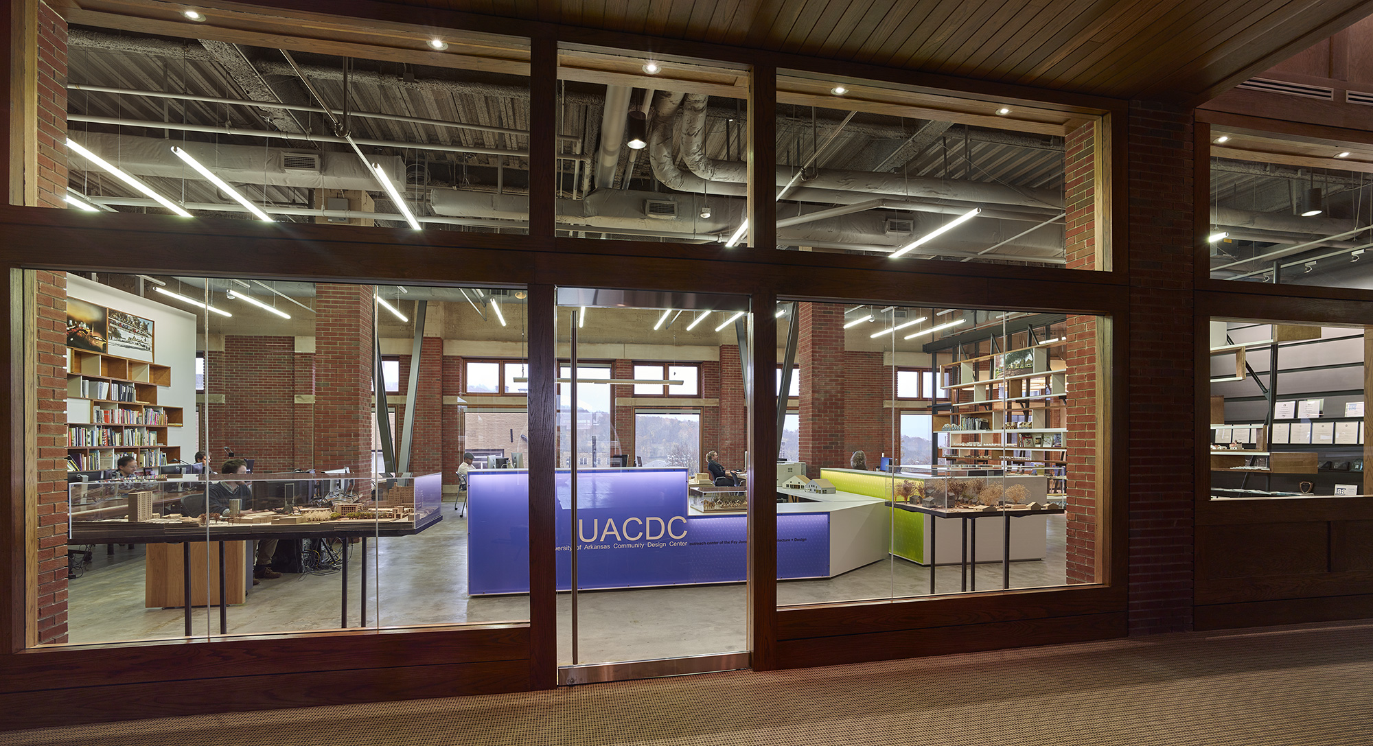
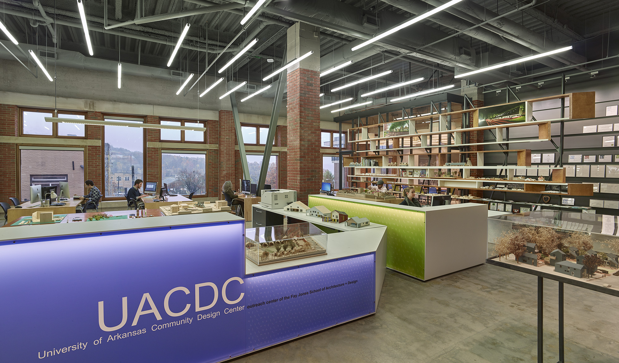
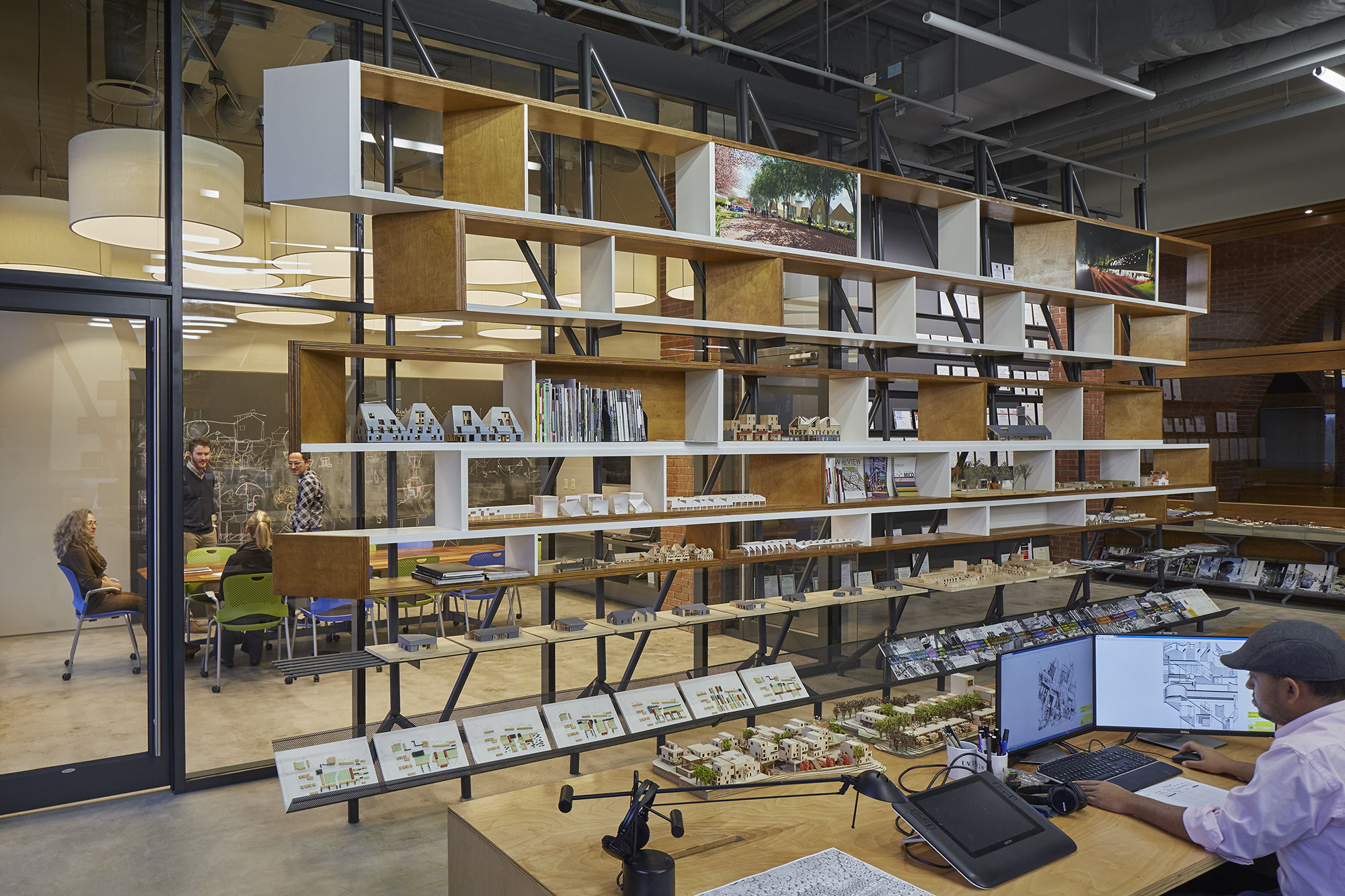
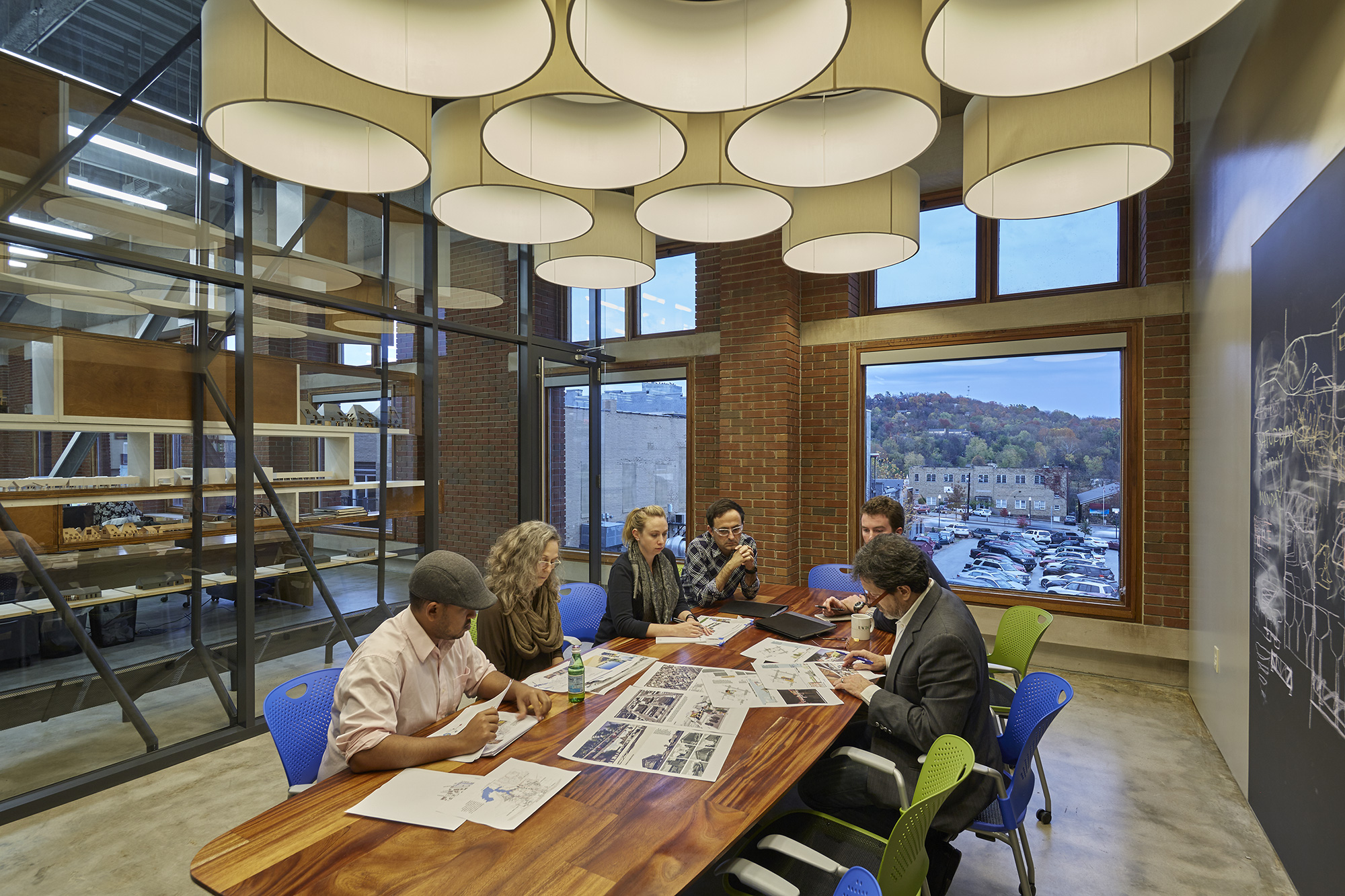
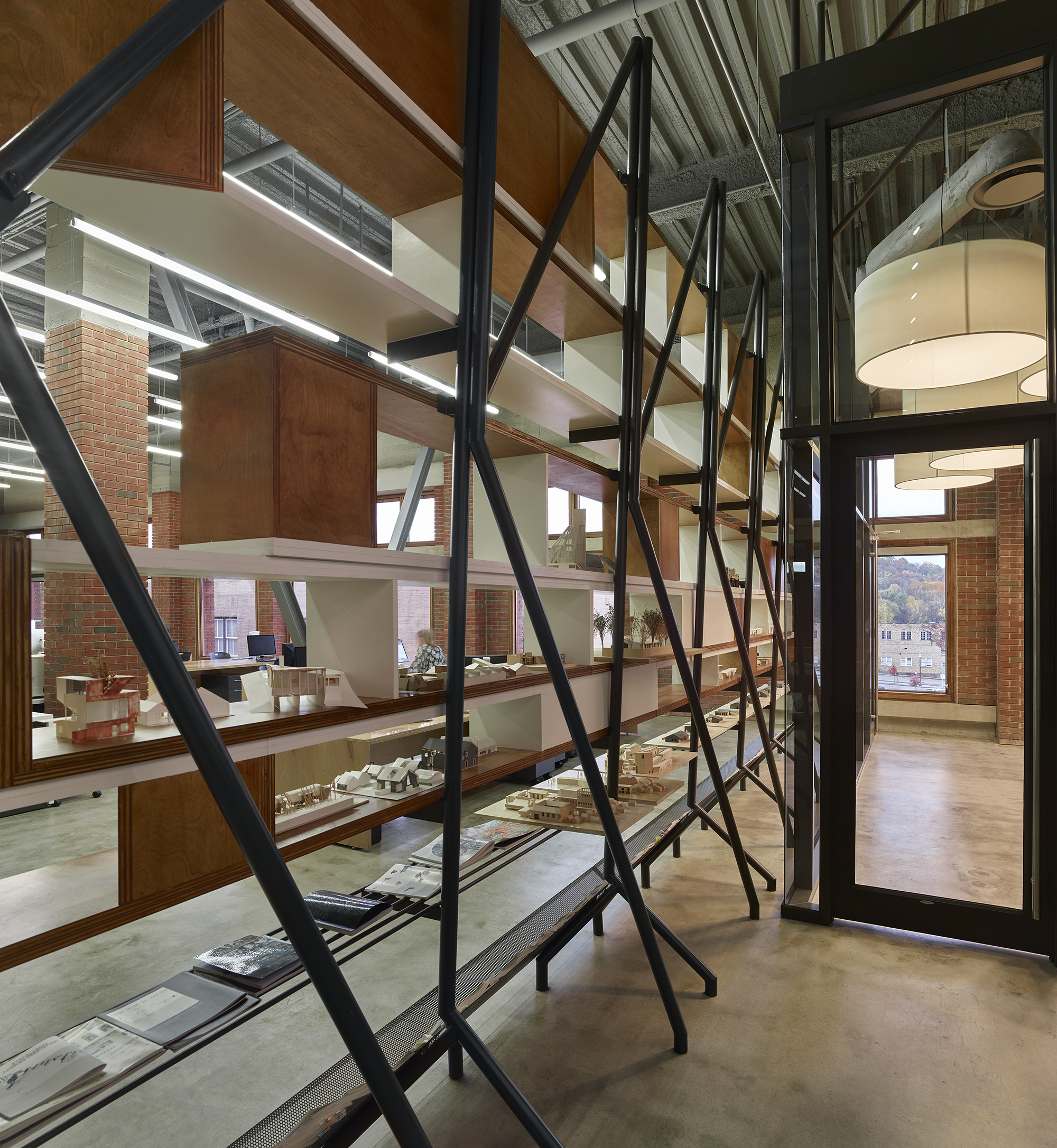
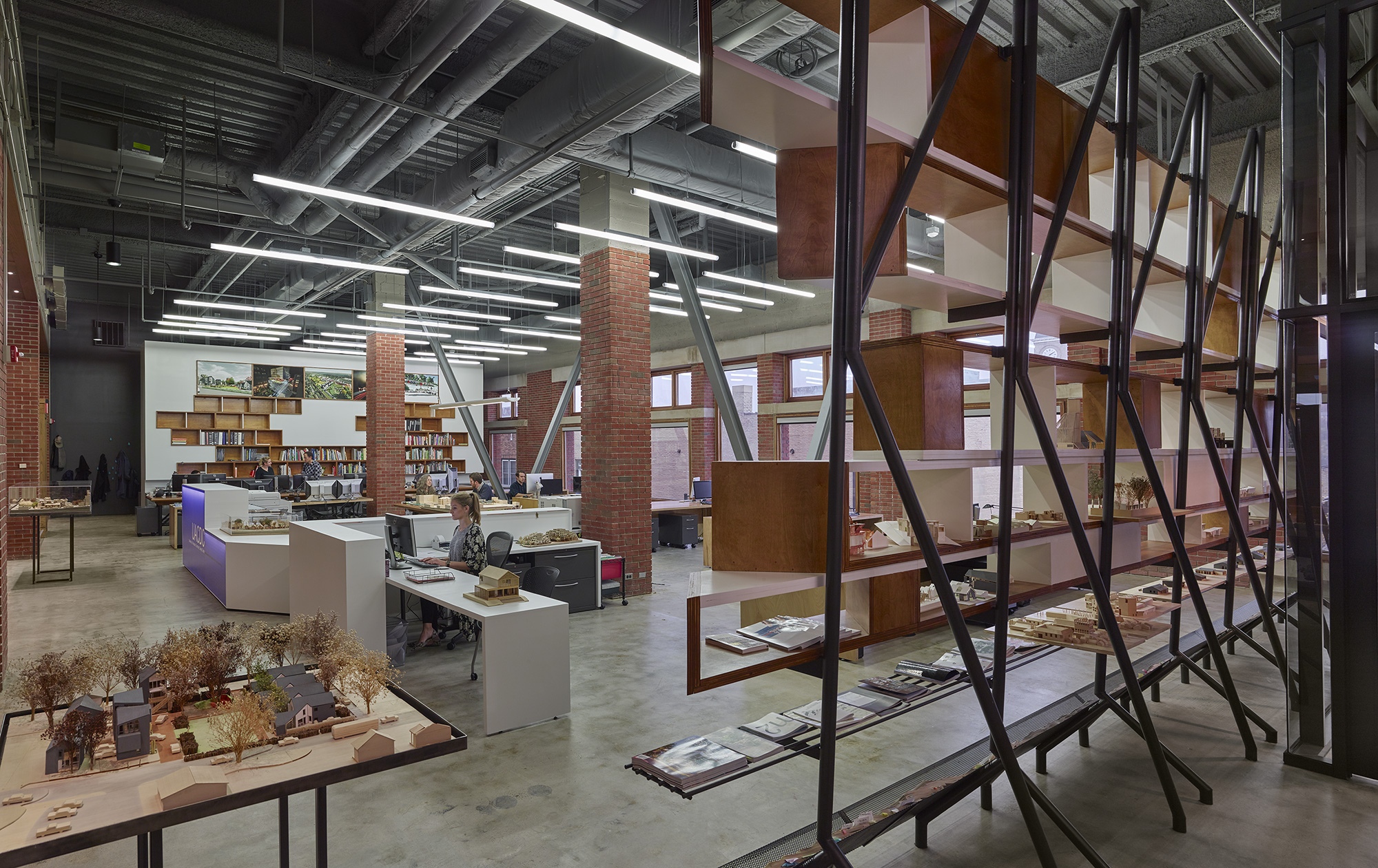
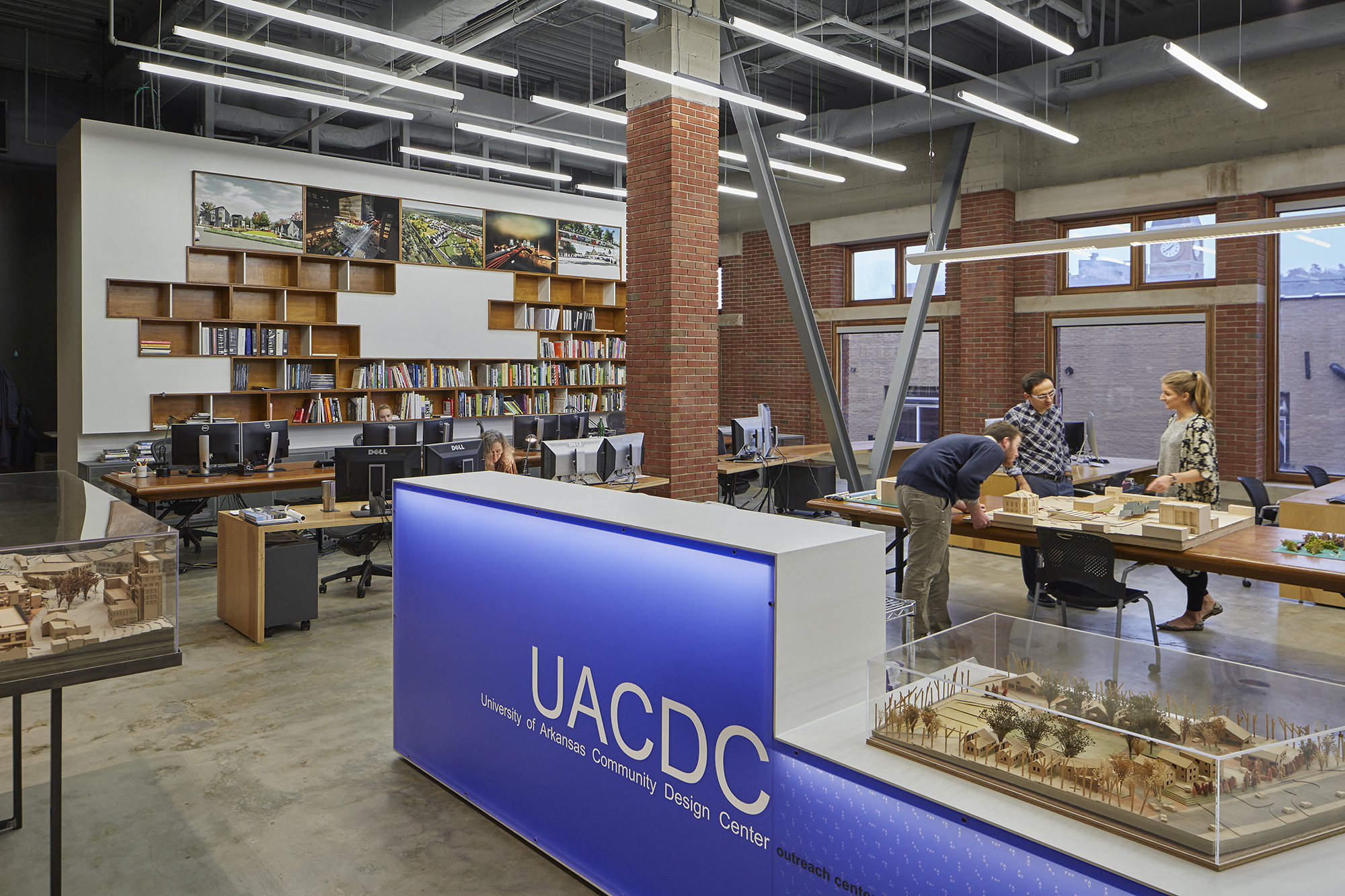
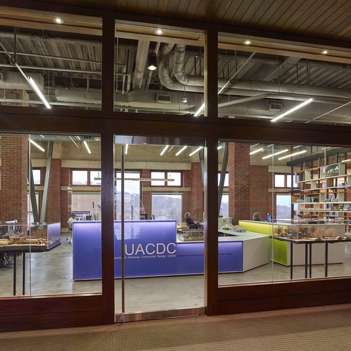
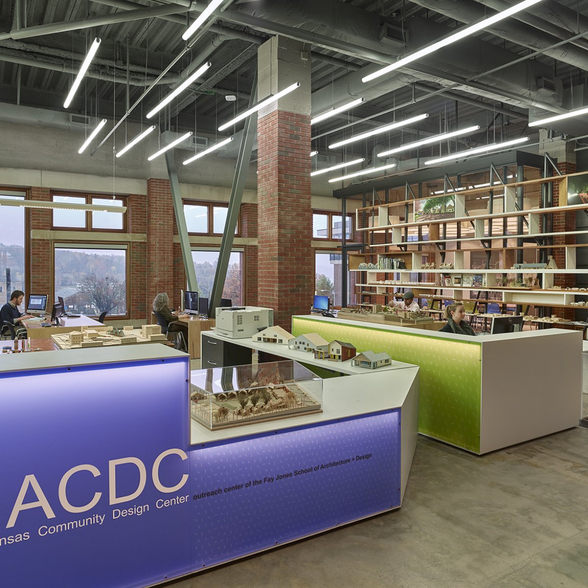
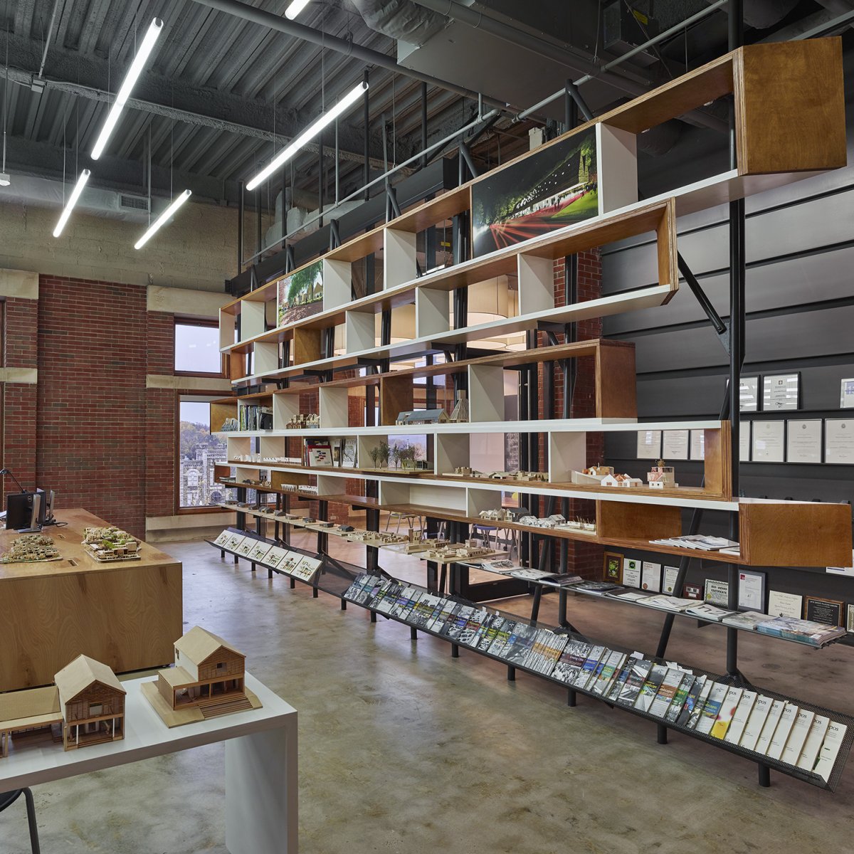
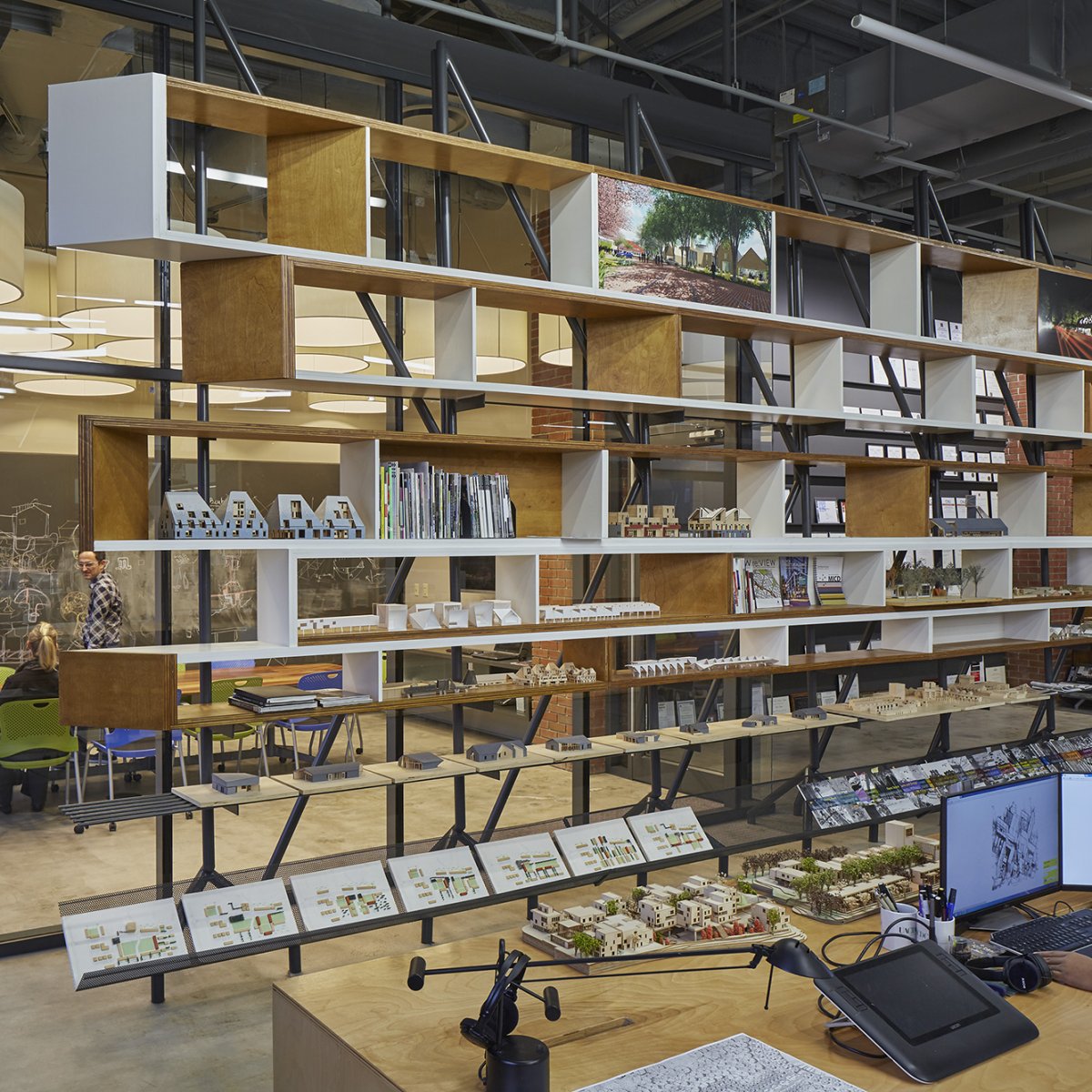
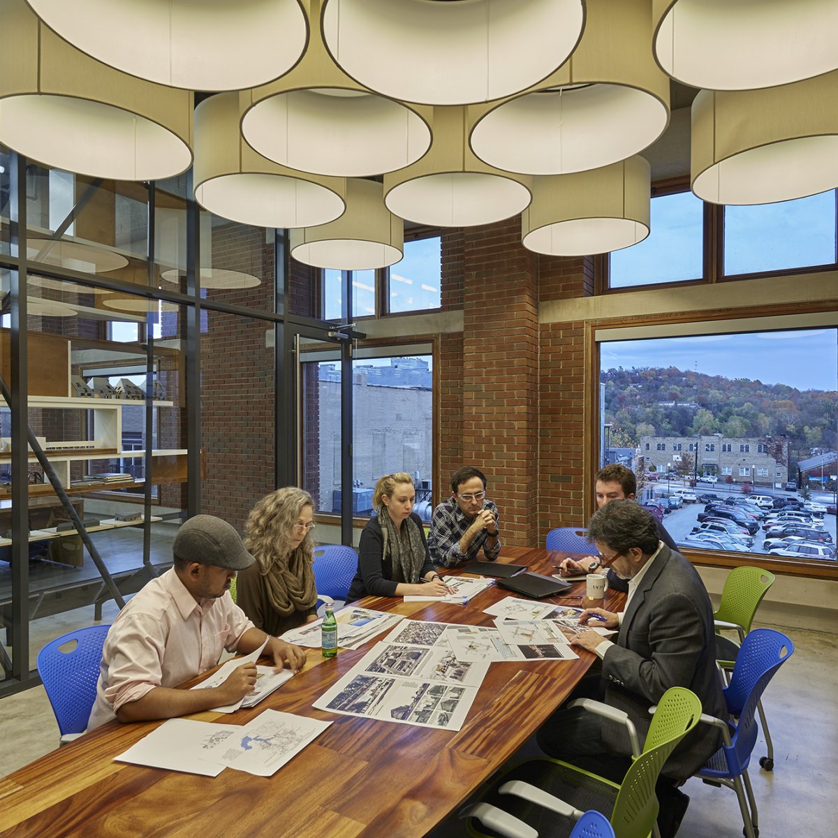
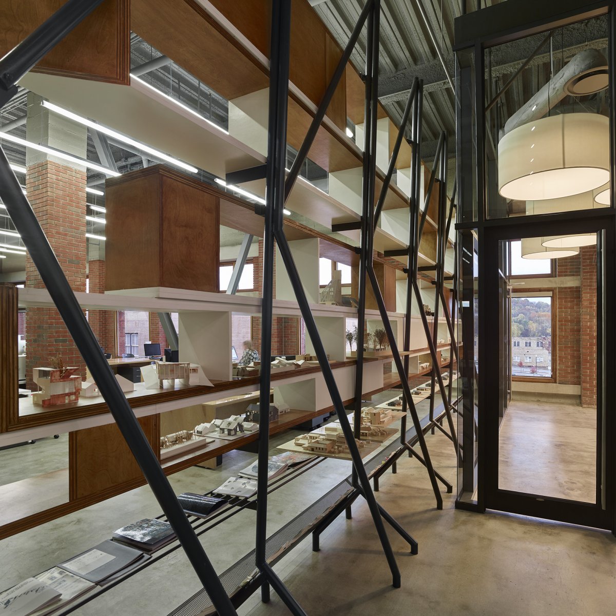
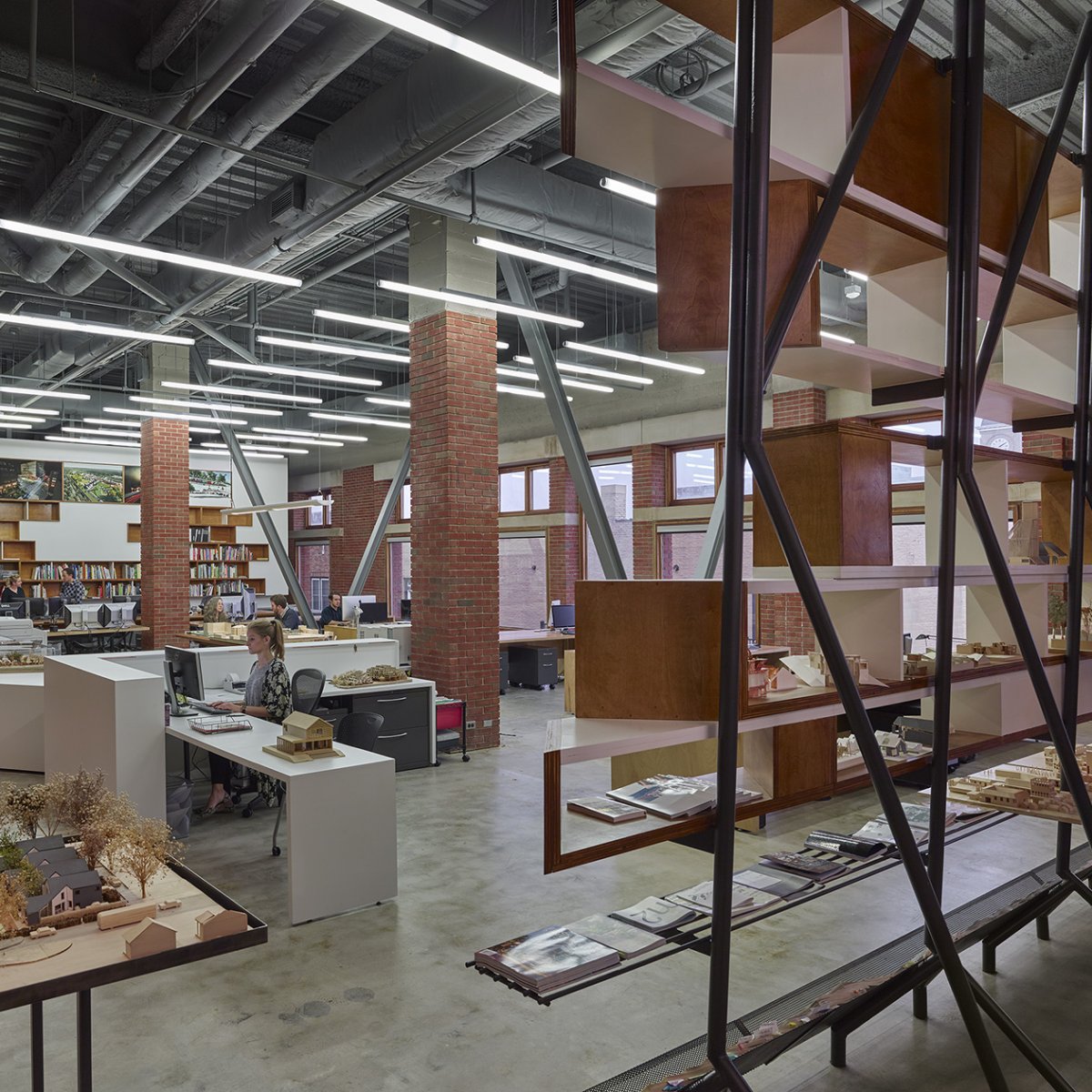
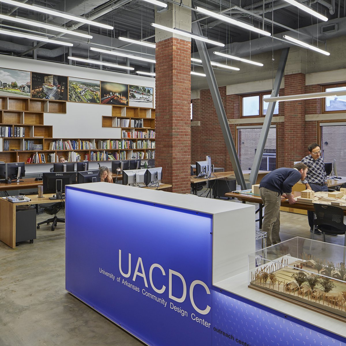
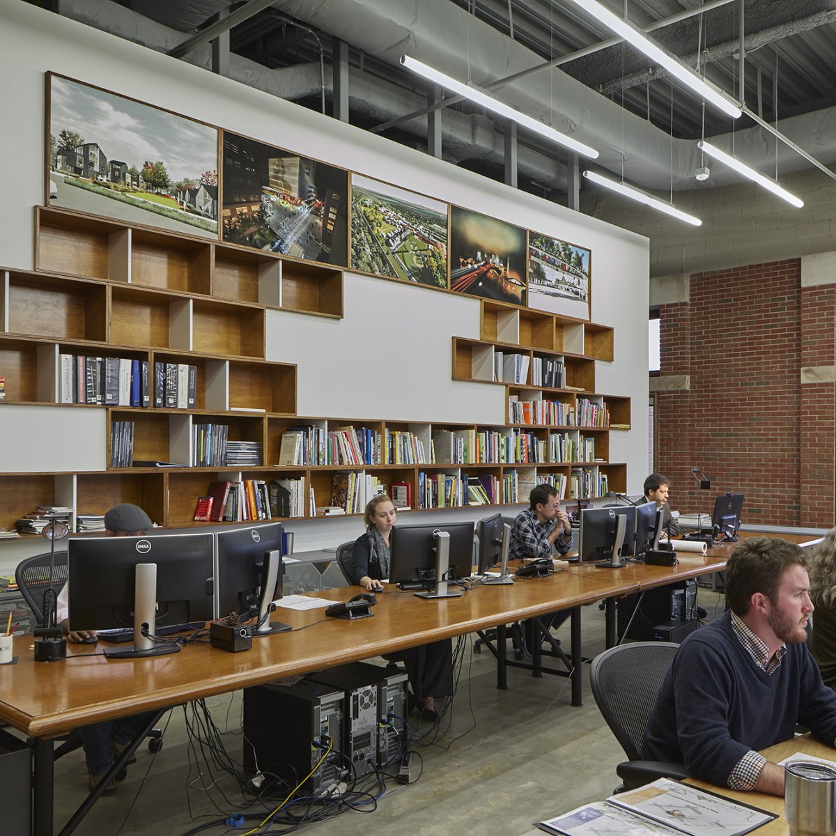
The tenant space renovation for an off-campus community design center reclaims the muscular expression and scale of the original masonry-clad building accompanied by contrasting lightweight interventions. Renovations remove the warren of offices (and their lay-in surfaces) subdividing the masonry structure and covering large-scale windows with views to the Ozark Plateau. Two sculptural walls were introduced into the 3,100 square foot shell, which frame the main studio space in a saddlebag plan. Dialectically, each wall shares similar shelving, height and plan dimensions, yet their tectonic differences are borne through a reverse solid-void relationship describing carving or assemblage. The intervention reconciles the original building’s strong symmetry with the asymmetry of support spaces in the conference room and kitchen/storage/service opposite, while maintaining visual continuity throughout the center’s modest space.
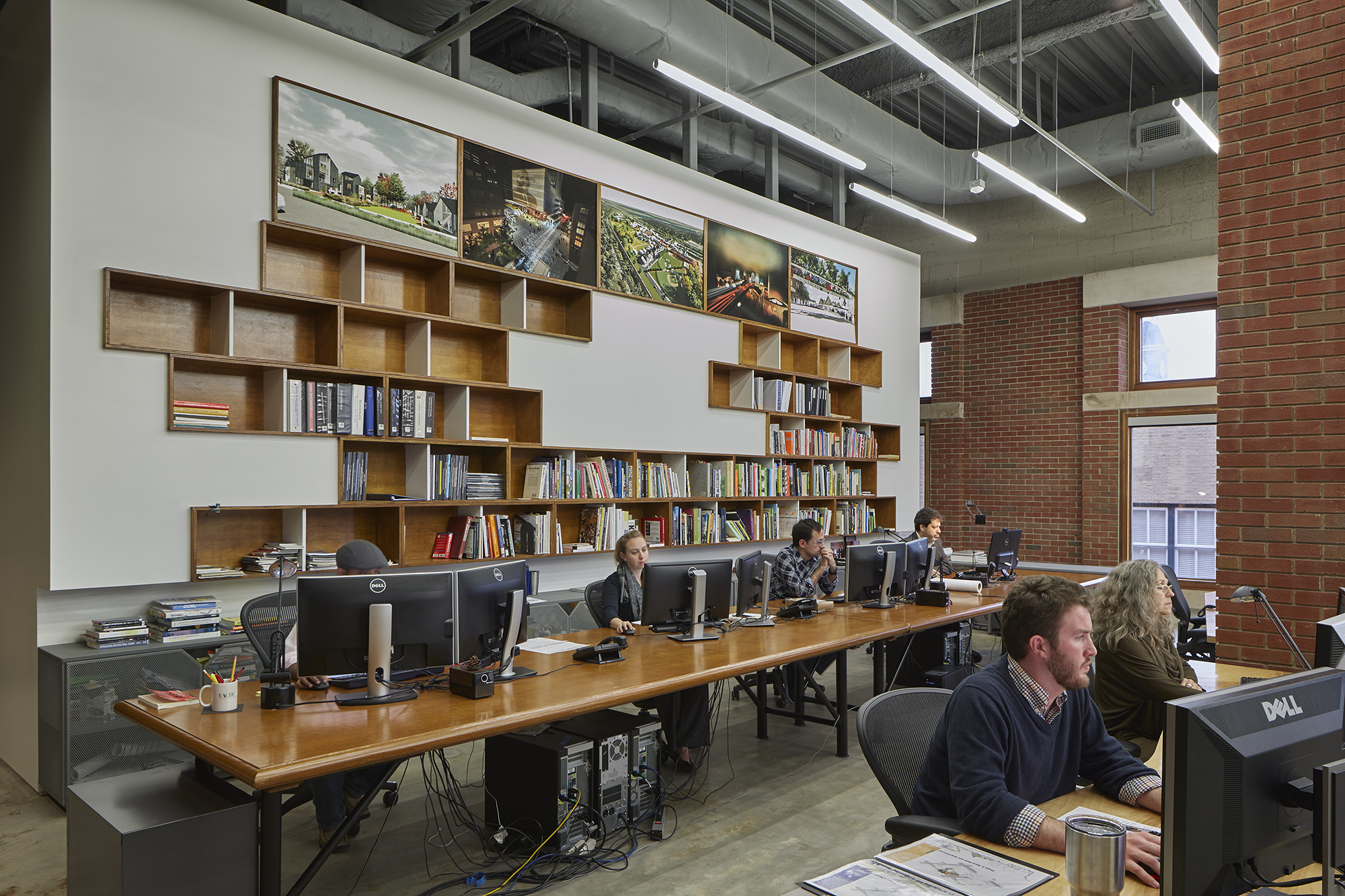
Studio processes are curated for a public who access this mixed-use public building housing university outreach centers, art studios, restaurants, and shops located on the town square. The renovation reconfigures the interior as a storefront to showcase the studio’s work on the second floor of this block-long atrium building. New components—whether furniture, credenzas, reception desks, shelves and walls—are lightweight multi-purpose steel structures to promote visual porosity. They define key heights across the studio, provide combined lighting/signage and storage, or offer display for books, periodicals, and models. Not only were custom interior installations cost effective—HVAC and electrical overhauls consumed 85% of the budget—but off-the-shelf options could not effectively address the 21-foot high volume.

